Melanie interviews Katherine Messenger, who designed and illustrated Thanksgiving. Visit Katherine at www.KatherineMessenger.com.
MELANIE: Thanksgiving a very beautiful book. It’s a real keepsake volume that I think readers will want to leave out on their coffee table and dip into again and again.
KATHERINE: Thank you, Melanie! It was a joy to work on your book. It was also, as you say, an unusual opportunity to do all the design and illustration work.
I began the design process by reading Thanksgiving and getting a feel for its texture, tone, and content. I immediately realized that it was heavy on history without being dry. It aims not only to inform but to entertain the reader, by way of anecdotes and colorful details and a brisk tempo.
This made me realize that my general watercolor illustration style with an inky line (set to pure black, like the type) could be used. I thought it well to include bits of whimsy, too, as they would create “entry points” into the pages, helping to draw the reader in to read.
MELANIE: What did you paint first?
KATHERINE: Before I did an initial page design, I worked on icons for the endpapers (they also later became section separators in the ten chapters). From endpapers I’d seen in a cookbook published last year, I knew I wanted a bunch of little icons presented in a grid layout. So I made a smattering of icons—apple, goose, tankard, pie, pumpkin, etc.—each about a half-inch tall. These felt like a warm-up for illustrating the rest of the book.
As I did them, I thought about other ways of using the same themes on a larger scale. As I worked, I made rough lists or sketches in my sketchpad about other ways to use the same image. Most of those ideas I never used, but that didn’t matter. I just needed to get my mind and hand absorbed in the topic. Once the icons were done, I moved on to creating a basic page design and choosing fonts.
MELANIE: What were your criteria for selecting the typeface?
KATHERINE: I knew I needed a family of typefaces that would complement the art and had many cuts for uses at different sizes (big titles, small chapter headings, comfortable-to-read body text, etc.). This would ensure that the page design would stay clean and elegant and spare. I also wanted it to have a warm, traditional feel and subtle details.
I turned to Hoefler Text and Titling, which I am very happy with. In the “Readings” and “Recipes” sections I added a font to the mix: Botanical Scribe, which is based on the handwriting of the greatest of botanical illustrators, Pierre-Joseph Redouté. I liked how its rather thick line resembled the black line in my paintings. And unlike many script fonts, it is highly legible.
Once I had a preliminary design nailed down, I knew I’d be creating rectangular illustrations to go at the top of each chapter heading. I printed drafts of each chapter-opening page and drew right on the sheets my initial ideas. Once those were set, I transferred the drawings onto a sheet of watercolor paper, sketched lightly, inked, erased the leftover pencil lines, then applied loose pools of watercolor paint.
Then I moved onto designing special illustrated drop caps for the Introduction and Afterword. Then I moved onto designing the “Readings” and “Recipes” sections, and so on, until all was done. Then I made passes over everything a few times to make sure all the visual elements felt of one piece. Many minute adjustments. The main thing was to set the style of the chapter heading pages. Everything else flowed from there.
MELANIE: I know you did a lot of research for each of the opening chapter illustrations. Can you give an example or two?
KATHERINE: I enjoyed researching these and coming up with various ideas to show you. Some are simpler than others (the opening is a strong and solitary maple tree in the fall, mostly to set the mood of the book and act as a welcome mat of sorts). Others are really quite rich with history.
Chapter 4 features George Washington’s inkwell, as it appears in the famous Lansdowne portrait of him by Gilbert Stuart. I love the tiny dogs on either side. People who know the painting will enjoy the reference. And people who don’t know the reference will probably still like it—well, as long as they like dogs. (There’s a cat on a table in “Recipes” for cat people.)
I am also fond of the Chapter 5 illustration, featuring a small cameo portrait of Sarah Josepha Hale (again, based on a portrait of her painted at the time) and, on either side, arching lines and flowers based on bits of embroidery patterns women used at the time. I tried to paint these parts so they would look embroidered on the page.
MELANIE: Your early sketches for the cover focused on a harvest theme–loads of pumpkins and gourds and other good things we associate with the holiday. Another early idea you had was a place setting with a handsome turkey painted on the dinner plate — an idea that eventually ended up as the opening illustration for Chapter 10, on the history of Thanksgiving dinner.
I remember writing back to you, No, no, no — the book is not just about food. We can’t mislead the reader into thinking this a cookbook. So, the final cover is very different. How did that evolve?
KATHERINE: I started out with several pencil sketches, shared them with you all, and then we whittled them down to two, I believe, and I developed those further with ancillary options and color schemes. I remember the one I liked the least (but still liked) was the one chosen because it hit the right historical notes—something I had not taken into enough consideration at first.
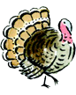
I painted a full version of the chosen illustration, and then decided to kill about 90% of it, as it read as useless filler to me and was much too busy. Now just the turkey with the circle of stars remains on the cover.
I especially like how the cover exists in relation to the endpapers, so that you first pick up the book, see this serene beautiful turkey on watercolor-like paper, then open the book to see the very busy and colorful endpapers, which get you excited about reading the book. Having the “pop” on the inside instead of the outside of the book makes the reader’s first experience with the book more intimate and stimulating. (Plus, there is a mini turkey in the endpapers based on its cousin on the cover.)
As this story made clear to me again, you do better work when you are willing to discard it. Make, judge, discard, refine, repeat. Also, the bits you get rid of stay in the back of your mind and have a way of reappearing in new work. No work is ever fully wasted. It shapes what you do next.
MELANIE: Why did you decide to work in watercolor?
KATHERINE: It reproduces well, has a long history in book illustration, and is also on trend in books these days. Plus, it has a warm, organic feel you can’t get from digital illustration. Marks by hand are unique.
MELANIE: Your illustrations for the “Readings” and “Recipes” sections are very witty. I laughed out loud when I saw Winston Churchill’s signature bowtie next to his words. Ditto the drumstick in the cocktail glass that accompanies F. Scott Fitzgerald’s quotation. How did you approach the drawings for those two sections?
KATHERINE: These were so much fun to think about and then to make. With such a rich cast of characters in “Readings,” and such a vast array of ingredients in “Recipes,” I thought it would be a shame to not have these sections profusely illustrated. (Plus, it helped regulate the layout and ensure better page designs. Bonus!)
I started by blocking out sections in the designed pages for art and then shared with you and Heather Ohle, the production manager at Encounter Books, my ideas for all spots. I mostly got ideas for what to place here and there by your writing and then adding a tiny bit of spin or unexpected dash of color or humor.
Some, like the cocktail, are just from very eccentric corners of my brain. (What can I say? I love unexpected garnishes.) Once we were set on what I’d draw, I got to work. Some—like that cocktail glass—took five minutes. Some—such as the young man exasperated at a big family Thanksgiving dinner—took hours. I researched what sort of attire folks would be wearing in the various periods, came up with poses, and then tried to draw them with as few lines as possible so they would read well small. A lot of time is spent sitting or standing in the poses I want to draw, and then I draw them. It’s weird, but it works.
MELANIE: One of my favorite parts of the holiday is the pies, and I loved your illustration for the “Recipes” section showing an array of different kinds of pies. Did any of your favorite parts of Thanksgiving make it into your illustrations for the book?
KATHERINE: I second you on pies! My father, a Texan with a sweet tooth, is a pie man. He loves pies, and bakes many in the summer using blueberries and rhubarb from his own garden. Naturally, I thought of him whenever I drew a pie—and there are about a baker’s dozen in this book. And I thought of the elaborate settings my mother makes at tables when I drew the opening illustration for “Recipes.”
I also included a Jack Russell Terrier in the football chapter illustration. This was in honor of one of my dogs growing up, Daisy, who had a habit of leaping up at food, whether it was behind a pantry door or resting on the dinner table. I also fitted into the book two instances of Brussels sprouts, which remind me of my husband, who first made them for me when we were dating. Plus, unlike most other Thanksgiving fare, except cranberry sauce, Brussels sprouts are not in the ugly taupe/cream/beige/brown category. I was keen to include dishes of this bright green vegetable where possible.
MELANIE: Thank you!
KATHERINE: My pleasure, Melanie!